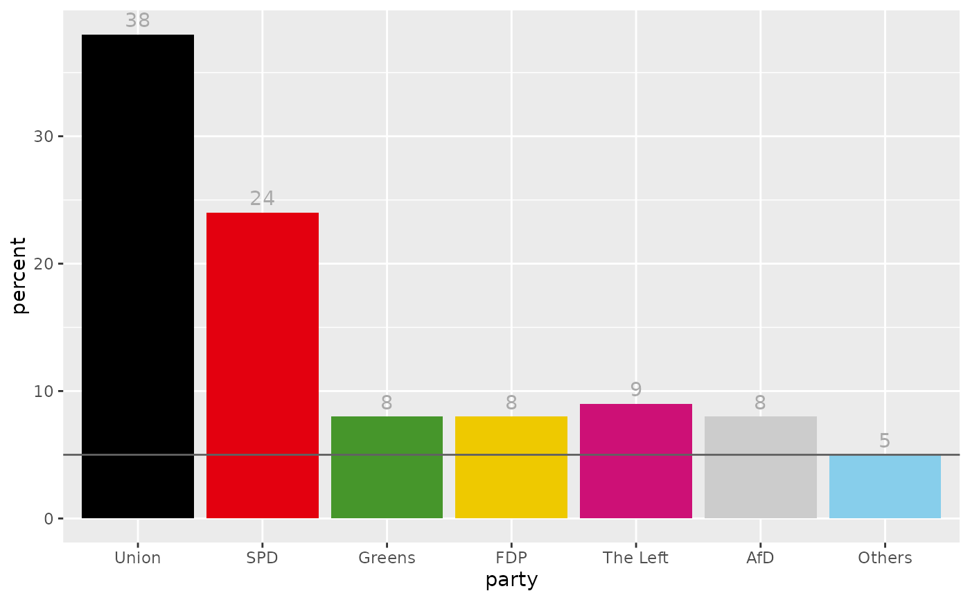
Bar chart of the raw voter shares observed in one survey. Additionally to plotting positive voter shares, the function can be used to plot party-specific differences (e.g. between a survey and the election result), including negative numbers.
gg_survey(data, colors = NULL, labels = NULL, annotate_bars = TRUE, hurdle = 5)Arguments
- data
Scraped dataset containing one row per party in the column
partyand the observed voter share in the columnpercent- colors
Named vector containing party colors. If
NULL(default) tries to guess color based on party names, gray otherwise.- labels
Named vector containing party labels. If
NULL(default) tries to guess party names fromdata.- annotate_bars
If
TRUE(default) bars are annotated by the respective vote share (percentage).- hurdle
Hurdle for single parties to get into the parliament, e.g. '5' for '5%'. If set to NULL no horizontal line is plotted. The horizontal line can be suppressed using
NULL.
Value
A ggplot object displaying voter shares as a bar chart.
Examples
library(tidyr)
library(dplyr)
library(coalitions)

survey <- surveys_sample$surveys[[1]]$survey[[1]]

gg_survey(survey)
#> x was converted from factor to character!
#> Warning: `aes_string()` was deprecated in ggplot2 3.0.0.
#> ℹ Please use tidy evaluation idioms with `aes()`.
#> ℹ See also `vignette("ggplot2-in-packages")` for more information.
#> ℹ The deprecated feature was likely used in the coalitions package.
#>   Please report the issue at <https://github.com/adibender/coalitions/issues>.